USO Thrives Identity
Growing internal engagement with a new employee development initiative
- CATEGORY: Graphic design, branding
- CLIENT: University System of Georgia’s Office of Leadership and Institutional Development
- PROJECT DATE: November 2020
- MY ROLE: Graphic design and identity development; creation of collateral materials and a style guide
- TOOLS USED: Adobe Illustrator; Microsoft PowerPoint, Word
Project Overview
USO Thrives offers personal and professional development for University System Office employees at all levels, from new hires to seasoned veterans looking to advance to executive leadership. Courses are a mix of individual seminars, workshops and longer-term cohort-based learning.
Ahead of its launch in late 2020/early 2021, I created an identity for USO Thrives to foster employee engagement with the program. I provided a set of collateral materials designed to support the program’s cross-channel messaging and sustain its recognition over time.
The hallmarks of the USO Thrives identity are fun, flexible and foliaged!

The Challenge
How do you create a brand identity without a logo? Dr. Wendi Jenkins, the author of USO Thrives and my point of contact for this project, initially requested branding services to include logo creation for Thrives. In fact, she requested not one logo but potentially multiple logos for the programs that fall under Thrives.
Thrives does, in fact, present a unique challenge in that it comprises several programs, each one targeting a different audience: senior leadership, middle managers, front-line workers, new hires and, well, everyone. As the keeper of USG’s branding guidelines, however, I felt a Thrives logo, much less several logos, would be a no-no (which is slightly ironic considering months prior Wendi had taught my USG Communications teammates and me about “yes, and” — the alternative to “no, but.”)
USG is a sprawling system serving 350,000 students and thousands of faculty and staff throughout Georgia. The USO, USG's central office, has more than 500 employees, with five major sectors in four cities. To keep everything in check, USG utilizes a logo-identifier system. I also know that if I create a logo for one project, initiative, division, department or team, then I will end up with logo requests from all of them. I haven’t mastered “yes, and” enough for all that! Thus, I set out to convince Wendi that I could design a cohesive look and feel for Thrives — a distinct identity with differentiation between the programs — without any logos.
The Solution
As someone who coaches other people on how to be more Talented, Healthy, Reputable, Innovative, Vision-minded, Engaged and Service-oriented, Wendi comes prepared. She had already done focus groups on Thrives by the time we got started on the visual branding. One of the focus group must-haves was utilizing a variety of channels to communicate about the program, so I knew I would have to design something that worked in a variety of formats.
An interesting statistic Wendi contributed: According to one inter-generational survey, 70% of respondents reported that job-related training and development opportunities influenced their decision to stay at an organization. Beyond that, Thrives is an investment in developing good leaders in higher education. As with any internal initiative, employee buy-in was a priority.
In our first meeting, Wendi and I brainstormed ways to visually represent Thrives and attract participants. Though my goal was to steer her away from the idea of a logo, I still needed to know how she thought Thrives should look. Wendi knew she wanted something fun and catchy. We discussed things that would fit with the name Thrives, which signifies the growth experienced in the different programs. One thing we quickly agreed upon was that the color palette should include green. But we also needed a way to tie the programs together. I started to lean toward the idea of a plant or tree. Wendi initially liked the concept of a ladder and/or a tree.
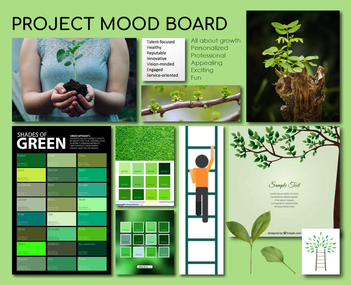
With everything we had talked about in mind, I created a mood board. I knew I couldn't be too literal or realistic with any design, or it might start to resemble a logo. As I looked at all the green color palettes I had gathered and played around with leaflike shapes in Illustrator, I developed a plan.
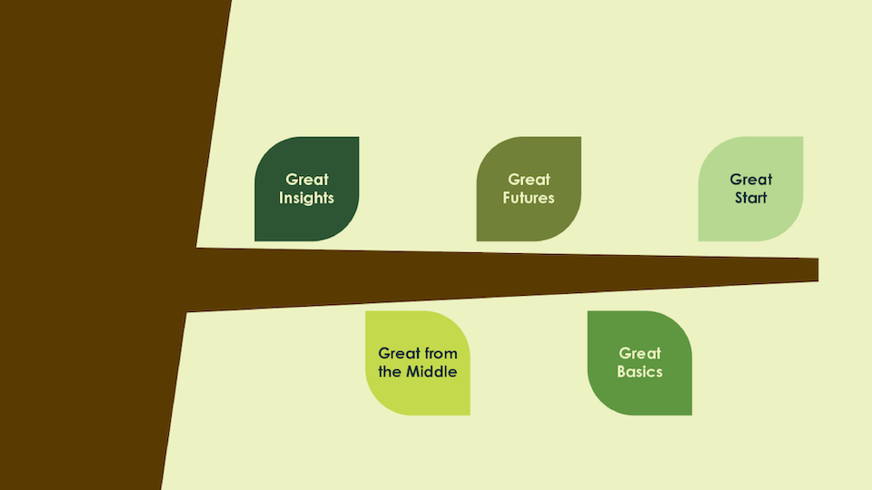
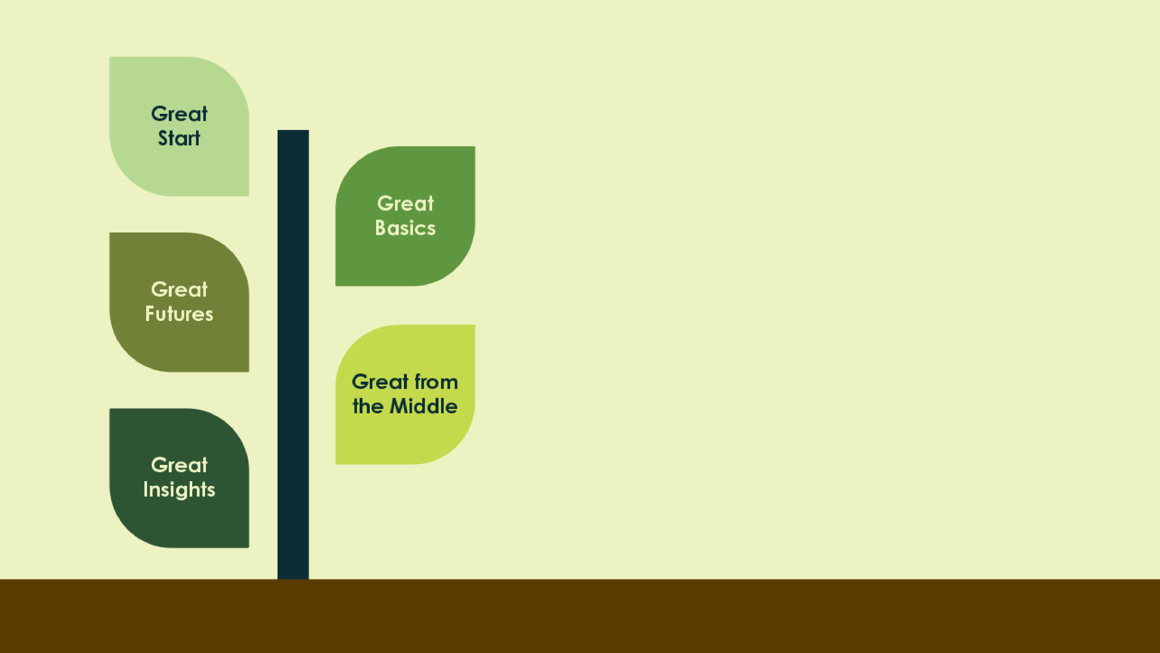
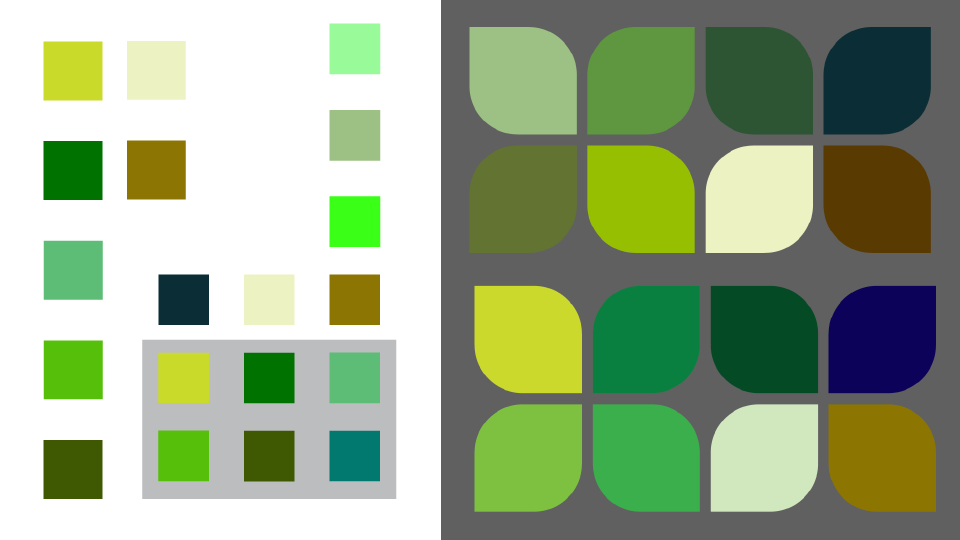
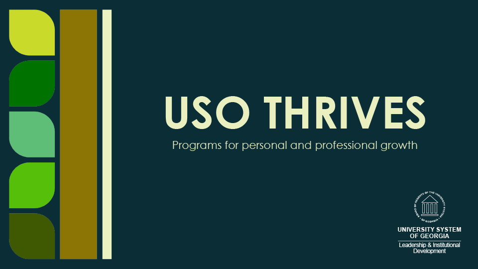
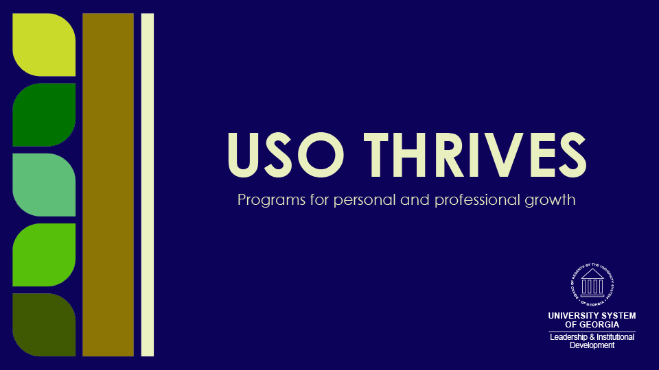
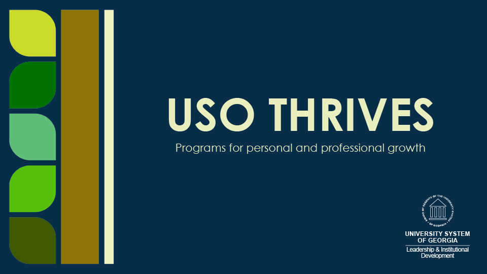
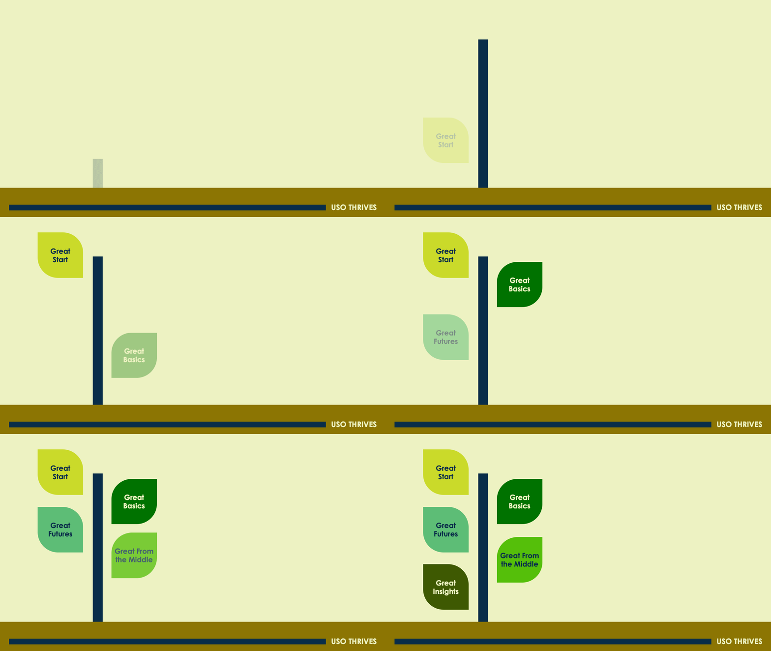
I typically adhere to the KISS method; in this case, as in most, it served me well. I took a very clean and basic leaf shape I had come up with to my next check-in with Wendi. Once she signed off, I forged on with the concept, developing an identity that hinges on these very simple abstract leaves. Each is a different shade of green, representing a different program within Thrives. They can be separated and used together in an alternating pattern. The graphic elements are flexible, and the color palette is open-ended. The result is a fun, funky, uplifting identity that fits both Wendi and Thrives and can be easily modified as the program matures.
The Results
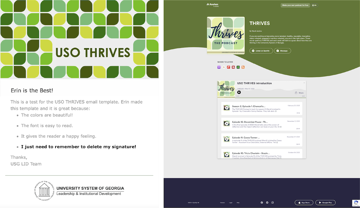
To help with messaging, I delivered a presentation template that can be adapted for any of the programs, templates for handouts for each of the six main programs, an email template and a style guide.
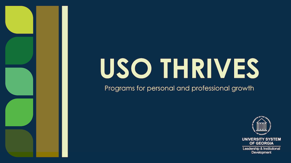
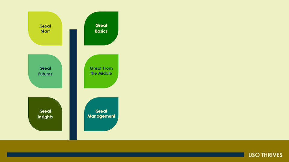
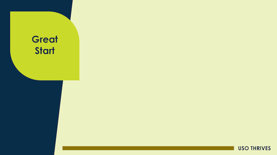
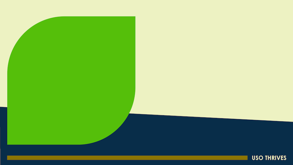
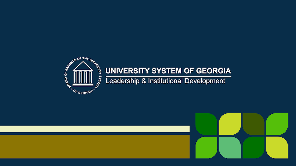
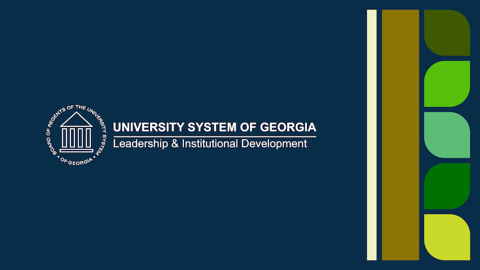
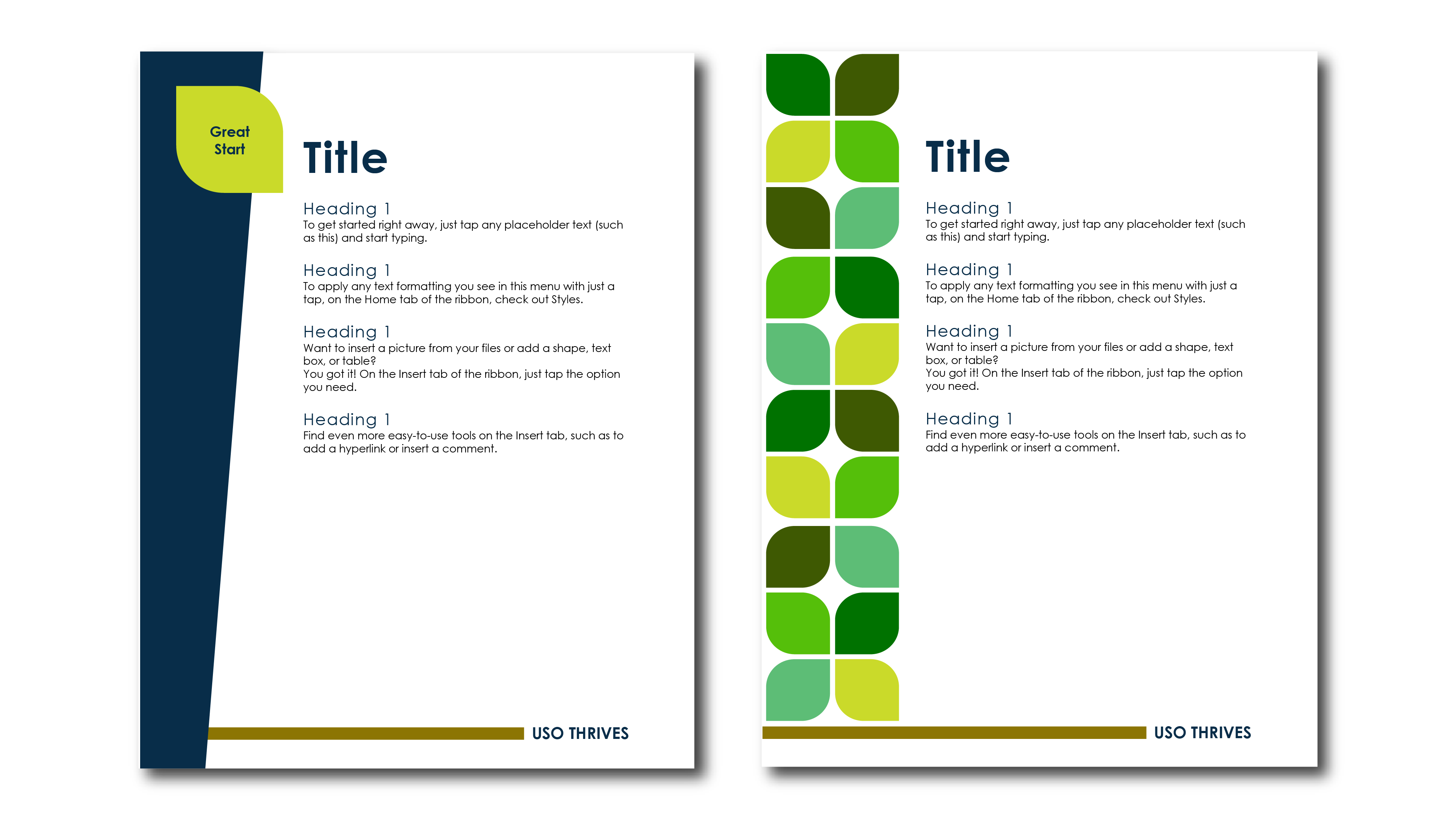
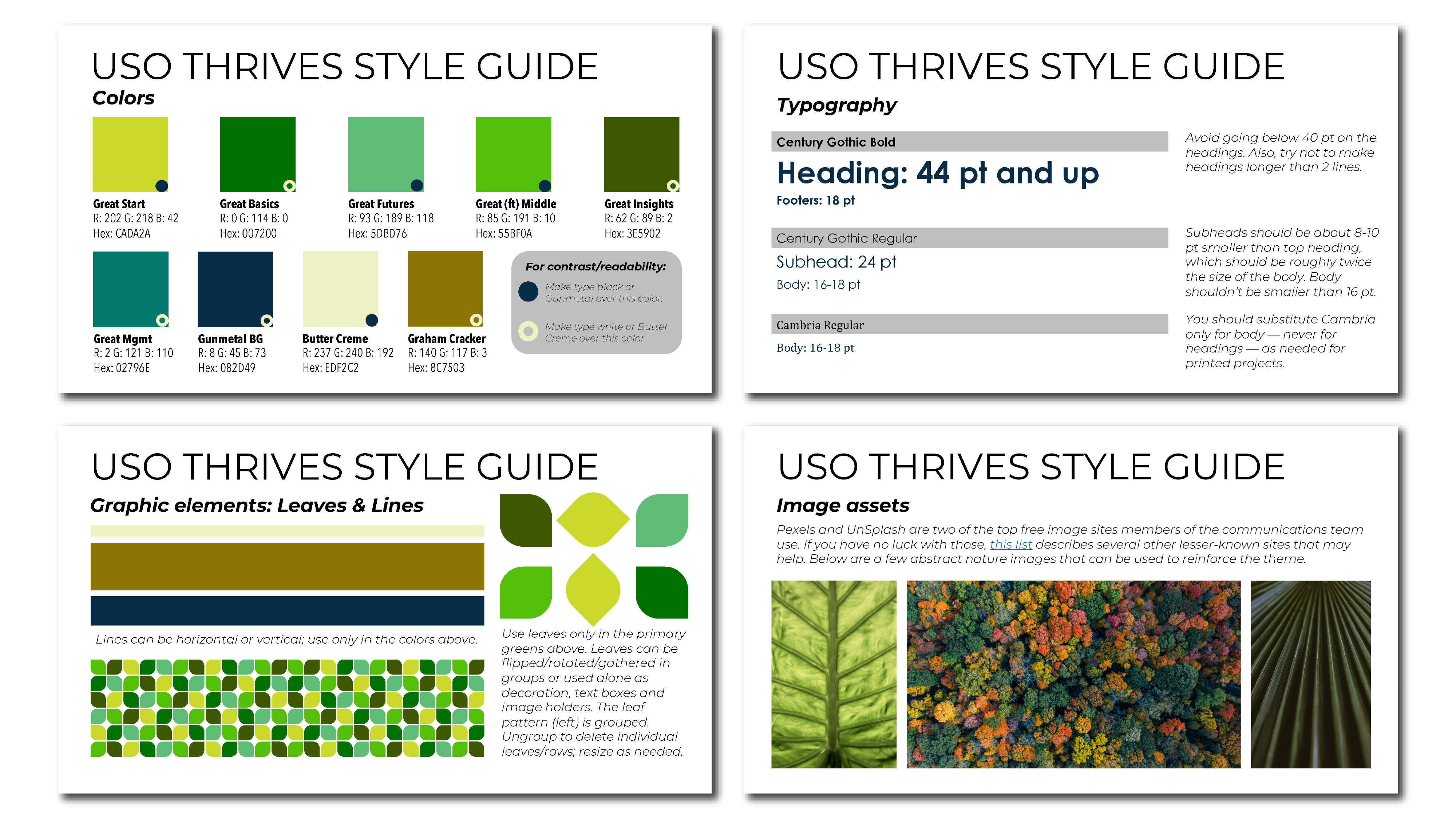
When I originally worked with Wendi, she had plans for five programs. Then, in February 2021, she requested help picking a color for a sixth program. She has since refined Thrives to four major programs and was preparing for the fourth Great From the Middle cohort as of March 2023. Wendi also launched a monthly podcast to accompany Thrives, and it’s now in its second season. She created the profile picture for the podcast and makes a new cover for each episode using Canva and the identity system I created, which I have to say has grown successfully right along with Thrives.