Project 1
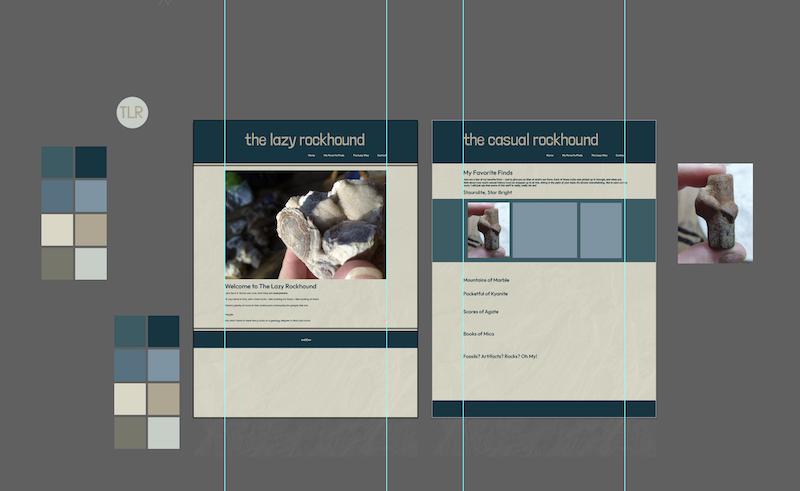
I decided to do the first project on something I enjoy, which is rockhounding. That was after I scrapped my original idea of doing a sort of make-believe bike business. I got really attached to a graphical component of that idea, which made it harder for me (as a designer by trade) to let go of. There were lots of flaws with the rest of the concept, however, and I wish I had spent a little less time on it.
That said, I had so much fun doing this project, despite some frustrations. Every time I was able to get a different part working, such as making the images scale properly, it felt like a massive victory, and I would run and tell whoever was closest at home. I am actually OK with how the design of the website turned out as well. Even though it’s very simple, I like how all the colors work together, and it’s extremely close to the version I mocked up in illustrator before I started coding (see screenshot). I am most excited that it looks good on mobile (at least on my phone!).
I had the hardest time getting the navigation to work. Originally, I had a < nav > section of code inside the header tag as an unordered list, and while I was able to get it to look how I wanted in that form, the links never worked for me. I finally turned to W3 Schools to get an example of code that looked similar-ish to what I wanted to do, and I modified the example to match my styles and eliminate the Javascript it included.
I wish I had settled on my ultimate plan earlier, as I think it would have helped me develop the concept and content and design a bit more. I had different ideas for the My Favorite Finds page with all the images that involved flexbox, but I had to go with what I could get to look good in the time frame. I am interested in learning more about how to leverage flex containers for images or the best way to present images in an orderly way when the images are different sizes. View Project 1
Project 2
I got really inspired when I saw a picture of astronaut Bruce McCandless II floating in space untethered (seen in my One-of-a-kind Experiences cards). The photo is old, but it was making the rounds on Twitter recently. I stumbled upon some NASA photos on Unsplash while learning about Bootstrap, and that same photo was included. I decided then I wanted to make my website about space, but I wasn’t sure how to approach it yet. Later, I was doing the Google DevTools walkthrough. I’ve been using Inspect for years for sizing and to learn font names but had no idea how important those tools actually are. During the walkthrough, I was asked to highlight and inspect the text “The Stars My Destination.” And the idea for my space travel agency website was born. Looking back, I don’t believe I would have been able to do this project successfully without utilizing Inspect. Cover Page
Project 3
Brick and mortar candy shops are awesome, and I wanted to match the fun, sweet, whimsical feeling they impart as much as possible without coming across as overly kiddish. I was surprised at how lifeless some of the other online candy shops I checked out were. I tried my best to head in the opposite direction, for better or for worse, and if I had had more time, I would have built in more whimsy. I was thankfully able to use my existing design skills to quickly create the mystery box gif, an idea I lifted from sugarfina.com. I got some of my product descriptions from Sugarfina and justcandy.com as well, though I reworded them as much as possible.
Even though I do like my shop, and WooCommerce makes eCommerce seem easy, I am not totally sold on WordPress overall. I don’t think it’s particularly intuitive. You have to go back and forth between the block editor and theme editor, and it just seems impractical and awkward for everyday users. On top of that, it’s not actually WYSIWYG, and I would often get something looking great in the block editor only to find it totally different in another browser. It’s difficult to adjust the styles reliably with both CSS editors, though I did have success with some critical things like spacing. I ended up switching themes from Storefront to Astra, which allows a little more customization. Given more time, I definitely would have gone the child theme route.
The only plugin I added was to back up my site before I changed my theme. I considered an optimizer because I wanted a robust inventory for aesthetics. That entailed utilizing a lot of stock images. In the end, I was worried an optimizer would interfere with my gif. I did go back and scale down some images that didn’t need to be as large to help alleviate any potential load time issues. I also put in a sidebar on my product pages, some dummy reviews and created a coupon. Expires 7/11. View Project 3