Welcome to The (New) Casual Rockhound
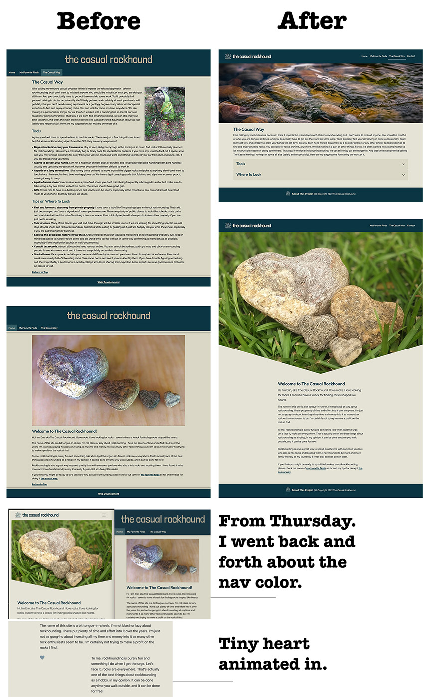
It looks a little bit different around here, doesn't it?
Visually, there are some obvious changes in terms of better photos and a slightly cleaner, more modern-looking aesthetic, but the site overall still has the same understated feeling, which is by design, of course. Some of the changes I made are also more "under the hood." For instance, I figured out how to make my images responsive, space paragraphs properly and put my nav in the header, none of which was done correctly during Project 1.
A few of the techniques I used for this site that I had not used at all before in previous projects include the tabs for My Favorite Finds and the accordion on The Casual Way page. In fact, the only reason I went with varying methods — rather than just using accordions or just tabs — is so that I could gain experience doing both. I tried to include the JavaScript slide-in effect from Project 4 — a heart shape floating in the homepage — and it worked, but only partially. While you can make a clip-path heart with CSS, you can't use the shape-around part it seems. And sometimes it's just a tiny heart, and sometimes it's a giant square. Still, I did utilize a clip-path for the homepage hero that I got inspired to read up on during Project 3. That one was intended to mimic the shape of the heart rocks in the image.
I decided to redesign my first project for this class as my final project because I knew I could do it better this time around. I set out to create a better experience for users and do things I couldn't do last time, such as make it more responsive, improve the navigation and visually declutter to make it more inviting. I added the contact page so the site had more of a back-and-forth feeling to it, if that makes sense. My main personal goal was to use Bootstrap and not rely on a template, kind of blending parts of projects 1 and 2 together but then adding additional challenges to it by incorporating new skills. I'm proud to say I did accomplish that.